Less is More: Overcome OEE Analysis Paralysis

Imagine you have acquired a brand-new OEE analytics software for your organization, allowing you to closely monitor a wide range of metrics. The software seems promising, as you can now see hundreds of data points per shift. You feel confident and start thinking, "Capturing this much data should surely result in a dramatic increase in efficiency."
Every day, the production team receives comprehensive reports filled with detailed charts, graphs, and tables. In your regular meetings with them, you hear that the team is generally happy with the software. However, as time passes, you notice they are not taking any action based on the data they receive. The team seems overwhelmed by the sheer volume of information, leading to analysis paralysis. Discussions about the data focus on minor fluctuations within a subset of metrics rather than addressing critical issues. Before pointing fingers, you decide to load the software yourself to get an overall picture of your organization. You are shocked by the overwhelming amount of data, making it difficult to find what you're looking for. Unfortunately, you find yourself facing the classic "needle in a haystack" problem.
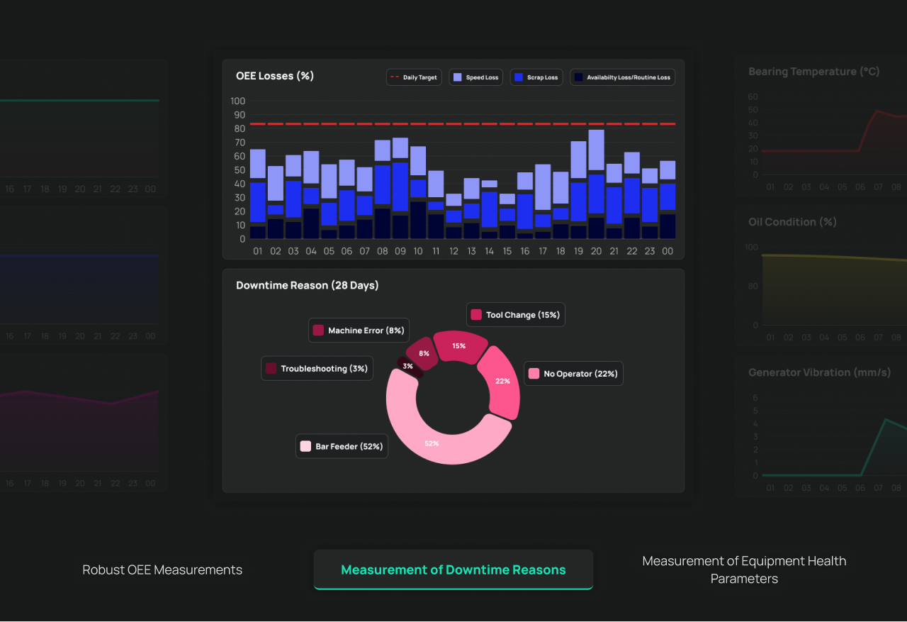
In ADG, we embrace the principle of "less is more" and streamline our users' focus on the most impactful metrics. We achieve this with simplified dashboards highlighting key performance indicators—such as availability, performance efficiency, and quality rate—enabling quicker and more effective decisions across various time periods. This targeted approach not only alleviates analysis paralysis but also enhances user engagement within the organization.
Please feel free to contact us if you would like to learn more about our product development efforts. We are more than happy to provide you with a demo of our product feature set and demonstrate how our product development efforts have a significant impact on our solutions at ADG.